
What I particularly liked about this digipak of Kodaline's, was the photography. I love the natural theme which is continued throughout, the feature of light, the technique of bleaching - as this is something that I would like to include in my video and therefore I can take inspiration from this. Equally, I feel that the tree shot in particular is striking and grabs the audiences attention, I do not however like the font as I feel that it doesn't stand out enough in certain shots and blends with the colour scheme as opposed to other covers where the album title contrasts the other colours.

What attracted me to this digipak was the layout and colour scheme. There is continuity throughout the booklet, album cover and CD which I really like and think that the contrast of black and white, with pastel colours is bold and fun. Aplin's digipak certainly stands out, and I also liked the font of the title. The font is bold, block capitals for the artists' name and I like the handwritten effect of the album title, to ensure the album feels more personal - although I feel that the album title font is too small and doesn't grab attention in the same way as the artist's name.

I was drawn to this album cover given its creativity. I like the artistic nature of the shot, which emphasises the importance of the artist. Moreover as well as the photography, I was drawn to the editing technique in the colour and lighting of the shot. The slight bleaching and out of focus lights, makes the image of the artist glow which I thought was interesting and different. The album cover is by an artist of the classical genre, and this appealed to me as it is classical with contemporary influences - which is what I intend to mimic in my own digipack and music video.
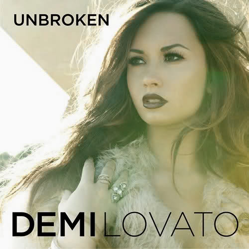
I like this album cover/ digipak as the font and colour scheme caught my eye. The font is big, bold and the artist name and album title really stand out, I think that the graduation of boldness in the artist name is an effective technique also and looks creative. Equally, the dark purple colour scheme is continued throughout the image, the colour matching Lovato's lipstick colour, eye make up and font colour - creating a sense of synergy.

Lastly, what I liked about this album cover was the photography. I think that the artistic nature of the portrait shot is effective in establishing the artist and ensuring that Bieber is the centre of of attention. I think that the cover is well shot and the album title certainly stands out, creating a contrast with the more traditional black and white theme. The only thing I am unsure of, is the size and positioning of the artist's name as I feel this does not really stand out as significantly as the album title.
I have researched digipaks of different genres and reviewed in particular what specific features I liked. Overall, I have found that the size of font is very important, colour schemes should contrast in some way to stand out and grab attention, whilst retaining a sense of continuity. As some kind of link between the image, font and colour scheme is vital in creating a sense of synergy for the artist and presenting my digipak as a viable product.
No comments:
Post a Comment