Popular band The Script's album 'Hall Of Fame' is a classic example of the photography, font and layout which is typical of an album poster. The poster is bold and eye catching, the type of font is consistent across both posters, the font for the band title being more decorative, and the album title and release date being much larger and more of a block font to really stand out. Moreover, the posters are very artistic, the monochrome theme is consistent and the contrast of black and white writing is effective. Equally, the motif of the band is evident form the posters, the leader of the band is clearly Danny O' Donoghue who is featured centrally in both posters, he is positioned furthest forward in the image to the left, and his face is far larger than his bandmates in the image to the right - to connote his importance and superior status within the band.

Below is the album poster for Ellie Goulding's 'Lights'. The poster features many generic conventions of the genre, for example the poster photography is a bust shot of the artist, ensuring she is the centre of attention. The poster has certain key features also, it details the artists' name and album title as the central focus, they stand out due to the luminescent quality to the font which has been enhanced with the use of CGI, to ensure that the writing and Goulding's hair/ background is filled with little lights, this is a clever marketing tool of convergence, as the same message is being portrayed across the album title, album cover, and poster. Another key feature of album posters which Goulding has utilised is the use of positive reviews on the bottom of the album, for example Ellie has used a quote from 'The Fly' stating her album as "A staggering achievement", and awarding her 4 stars - this encourages the audience to buy the album as it is clearly popular with critics.

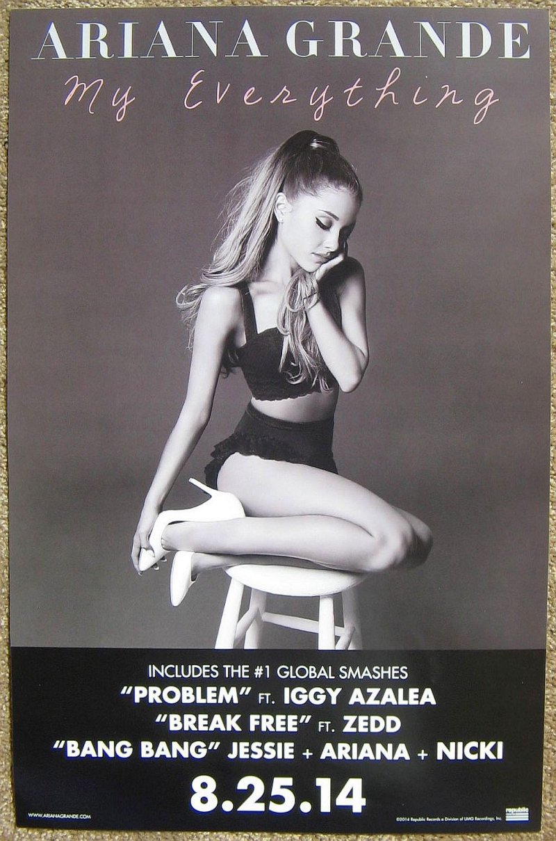
The following poster is for Ariana Grande's 'My Everything'. The poster conforms to the expectations of the genre. An artistic shot has been used of Grande, the image conforms to the motif of the artist, her trademark hairstyle and two piece outfit are key features of the photograph which provides a sense of synergy of the artists' image and will appeal to her fan base. Grande has used a monochrome colour scheme, the contrast of black and white allowing her name and album details to stand out. The poster is made more interesting by the differing colour font for the album title, the pink font is eye catching, and the font is far more romantic than the block capital used to highlight Grande's name and details - the effect of this is that the writing appears to be handwritten and more personal, drawing the audience to the poster. Lastly, the album poster contains key information, it uses bold, block capitals to focus the consumer on selling points like other artists' names who have collaborated on the album such as 'Iggy Azalea', and popular songs which will encourage the audience to want to buy the album. Finally the album release date is the crucial feature of the lower half of the poster which is a marketing tactic, that will generate hype and interest for when the album is released.
Overall, from researching album posters within digipaks I have seen that the artists' name and album title must stand out, they may be different colours and font sizes to achieve this, but a contrast in colours for the album title alone is what I believe to be the most effective. The structure of the album posters are all pretty similar, they feature a close up/ mid shot of the artist as the central image, the artist name and album title over this image or above it and key information at the bottom of the poster. The key information can be a number of things, it could be reviews of the album by critics, perhaps a reference to other featured artist - but most importantly is the album release date which must be bold and stand out to grab the consumer's attention.
No comments:
Post a Comment