Saturday, 24 October 2015

Digipak Research - What I liked

After researching the different elements of digipaks, I have compiled below the different elements that I liked and have taken inspiration from. These include things like font style, layout, colour schemes and photography, which i have been inspired by whilst researching other digipaks, and have given me ideas and influenced what I would like to use when it comes to creating my own digipak.
What I particularly liked about this digipak of Kodaline's, was the photography. I love the natural theme which is continued throughout, the feature of light, the technique of bleaching - as this is something that I would like to include in my video and therefore I can take inspiration from this. Equally, I feel that the tree shot in particular is striking and grabs the audiences attention, I do not however like the font as I feel that it doesn't stand out enough in certain shots and blends with the colour scheme as opposed to other covers where the album title contrasts the other colours.


What attracted me to this digipak was the layout and colour scheme. There is continuity throughout the booklet, album cover and CD which I really like and think that the contrast of black and white, with pastel colours is bold and fun. Aplin's digipak certainly stands out, and I also liked the font of the title. The font is bold, block capitals for the artists' name and I like the handwritten effect of the album title, to ensure the album feels more personal - although I feel that the album title font is too small and doesn't grab attention in the same way as the artist's name.


I was drawn to this album cover given its creativity. I like the artistic nature of the shot, which emphasises the importance of the artist. Moreover as well as the photography, I was drawn to the editing technique in the colour and lighting of the shot. The slight bleaching and out of focus lights, makes the image of the artist glow which I thought was interesting and different. The album cover is by an artist of the classical genre, and this appealed to me as it is classical with contemporary influences - which is what I intend to mimic in my own digipack and music video.  


I like this album cover/ digipak as the font and colour scheme caught my eye. The font is big, bold and the artist name and album title really stand out, I think that the graduation of boldness in the artist name is an effective technique also and looks creative. Equally, the dark purple colour scheme is continued throughout the image, the colour matching Lovato's lipstick colour, eye make up and font colour - creating a sense of synergy.


Lastly, what I liked about this album cover was the photography. I think that the artistic nature of the portrait shot is effective in establishing the artist and ensuring that Bieber is the centre of of attention. I think that the cover is well shot and the album title certainly stands out, creating a contrast with the more traditional black and white theme. The only thing I am unsure of, is the size and positioning of the artist's name as I feel this does not really stand out as significantly as the album title.

I have researched digipaks of different genres and reviewed in particular what specific features I liked. Overall, I have found that the size of font is very important, colour schemes should contrast in some way to stand out and grab attention, whilst retaining a sense of continuity. As some kind of link between the image, font and colour scheme is vital in creating a sense of synergy for the artist and presenting my digipak as a viable product.  

Tuesday, 13 October 2015

Digipak Research - Posters

A key part of a digipak is the advertising, or more specifically the album poster.  The album poster is a vital part of the advertising as it is what the audience is most likely to see when out and about, therefore an artist must ensure that it stands out and grabs the consumer's attention to make them want to buy their album. I will make a poster to go with my digipak when creating my music video, and so I am going to research different album posters to see what is effective, and how the artists have promoted themselves.

Popular band The Script's album 'Hall Of Fame' is a classic example of the photography, font and layout which is typical of an album poster. The poster is bold and eye catching, the type of font is consistent across both posters, the font for the band title being more decorative, and the album title and release date being much larger and more of a block font to really stand out. Moreover, the posters are very artistic, the monochrome theme is consistent and the contrast of black and white writing is effective. Equally, the motif of the band is evident form the posters, the leader of the band is clearly Danny O' Donoghue who is featured centrally in both posters, he is positioned furthest forward in the image to the left, and his face is far larger than his bandmates in the image to the right - to connote his importance and superior status within the band.


Below is the album poster for Ellie Goulding's 'Lights'. The poster features many generic conventions of the genre, for example the poster photography is a bust shot of the artist, ensuring she is the centre of attention. The poster has certain key features also, it details the artists' name and album title as the central focus, they stand out due to the luminescent quality to the font which has been enhanced with the use of CGI, to ensure that the writing and Goulding's hair/ background is filled with little lights, this is a clever marketing tool of convergence, as the same message is being portrayed across the album title, album cover, and poster. Another key feature of album posters which Goulding has utilised is the use of positive reviews on the bottom of the album, for example Ellie has used a quote from 'The Fly' stating her album as "A staggering achievement", and awarding her 4 stars - this encourages the audience to buy the album as it is clearly popular with critics.


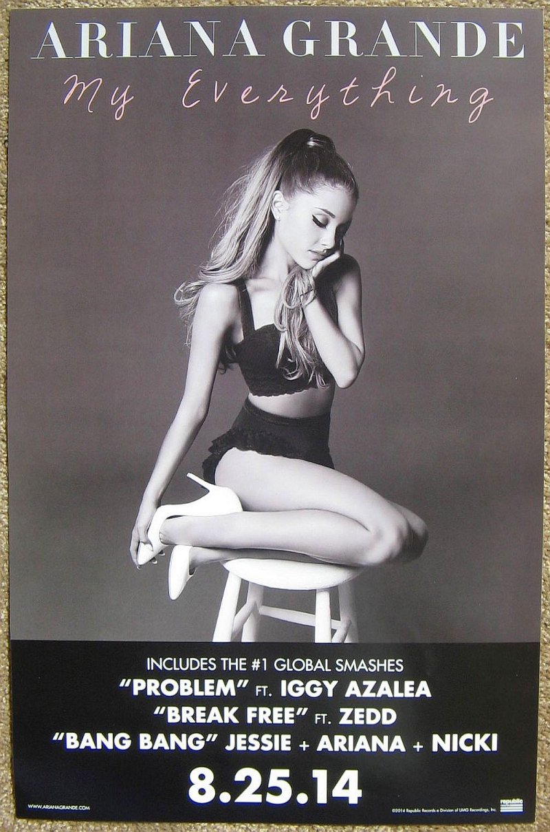
The following poster is for Ariana Grande's 'My Everything'. The poster conforms to the expectations of the genre. An artistic shot has been used of Grande, the image conforms to the motif of the artist, her trademark hairstyle and two piece outfit are key features of the photograph which provides a sense of synergy of the artists' image and will appeal to her fan base. Grande has used a monochrome colour scheme, the contrast of black and white allowing her name and album details to stand out. The poster is made more interesting by the differing colour font for the album title, the pink font is eye catching, and the font is far more romantic than the block capital used to highlight Grande's name and details - the effect of this is that the writing appears to be handwritten and more personal, drawing the audience to the poster. Lastly, the album poster contains key information, it uses bold, block capitals to focus the consumer on selling points like other artists' names who have collaborated on the album such as 'Iggy Azalea', and popular songs which will encourage the audience to want to buy the album. Finally the album release date is the crucial feature of the lower half of the poster which is a marketing tactic, that will generate hype and interest for when the album is released.    


Overall, from researching album posters within digipaks I have seen that the artists' name and album title must stand out, they may be different colours and font sizes to achieve this, but a contrast in colours for the album title alone is what I believe to be the most effective. The structure of the album posters are all pretty similar, they feature a close up/ mid shot of the artist as the central image, the artist name and album title over this image or above it and key information at the bottom of the poster. The key information can be a number of things, it could be reviews of the album by critics, perhaps a reference to other featured artist - but most importantly is the album release date which must be bold and stand out to grab the consumer's attention.


Thursday, 8 October 2015

Digipak research - Album Covers

As part of my task alongside the music video I will create, I must also create a digipak. I will research this by looking into the components of a digipak, such as CD covers and booklets, the posters used to promote new albums and the websites of other artists and groups. Moreover, I will research digipaks of the genre of song I have chosen, and outside of this genre to ensure variety in my work. I should be influenced by the designs and styles of all of these digipacks that I will research, which will hopefully give me a clear idea of what I wish to use for my own digipak.

  Components of an album cover


Front Covers


The front cover of a CD is usually very straight forward. The front cover will contain only three features in most cases; the photography, the artists' name, and the name of the album. As can be seen from the image to the left, lots of artists use a simple, close-up, 'headshot' style image so as to remain the focus of the cover. Most albums tend also to have the artists' name in large, bold print to stand out and the album title is either the same size, or placed centrally if slightly smaller. Adele on the other hand, has chosen to have both her name and album title in the bottom right hand corner, although the contrast in colours draws the audiences' eye to the title of the album.


Other artists however, such as popular band Coldplay prefer to use art for their cover instead of typical shots of the band/ artist. For their album 'Mylo Xyloto', the band have used a background of vibrant, colourful graffiti and the album cover title takes centre stage, with unusually no mention of the bands name either. This trend of cover art being used for CD covers has been used by artists such as Mika, Green Day, Maroon 5 and Christina Aguilera among others. The non conformist nature of this album cover and others like it, convey that the artist does not want to be typecast, but wants to stay different and unique within the music industry.


Back Covers


The back covers of CDs all tend to have certain features. These are shown in the image to the left of Taylor Swifts CD cover for her album, '1989'. The back cover will always contain a list of the song tracks, the name of the artist and album title along the spine, a bar code, the label name and information, as well as acknowledgements of producers and a tag line prohibiting copyrighting the CD/ filesharing. Some artists such as Swift choose to have an image on the back of the CD cover, this is usually of the artist and fits the theme of the front cover. Swift has used a unique style for her album, it feels nostalgic given the faded colours and handwritten elements of the cover.

Whilst some artists choose to use photography for the back cover as well as the front, other artists such as John Legend choose a simplistic format for the back cover. The cover is minimalistic, featuring only one block colour which matches the floral photography of the front. The track names instantly draw the audience's attention given the bold font and black colour ensuring that they really stand out from the pink.The added features are emphasised by the use of red font colour for the 'Bonus Tracks' which contrasts with the the other colours. The choice of colours are important, as these colours are usually associated with romance and have romantic connotations for the audience, this is an intentional decision by Legend given the romantic theme of the songs on the album, such as 'You & I'


Booklets/ Interior


The interior of CD covers contain a booklet. The booklet has numerous pages and different functions. The booklet uses a variety of additional photography of the artist, reflecting the nature of the album. All booklets contain a page like the photograph on the left. This is taken from Rihanna's album 'Loud' and is an acknowledgements page. Rihanna thanks those important to her in the open letter, including God, her family, friends, management, studio and agents.


The rest of the booklet contains pages like these; dramatic, photographic spreads which emphasise the artist and her creativity which is expressed in the model pose, her vibrant red hair and romantic pose with red roses. The pose conforms also to the male gaze, Rihanna's stance being quite provocative, this is a common feature of Album covers which is evident in the work of artists such as Miley Cyrus and Nicole Scherzinger Many of the songs on the album focus on the topic of love, as this is reflected in the photography of the album. The actual content of the pages is song titles, and credits as to who helped write/ produce the track.


This spread also connotes Rihanna's creative/ free spirit with the emphasis of interaction with nature and her body language conveying her peace. Although Rihanna, and others dedicate this space purely to song titles and credits, other artists use this space to provide the lyrics of their songs to engage with the audience. Bonus Albums frequently add additional material in the digipak to encourage their sales. Rihanna conformed to this promotional tactic and the deluxe version of her album, contains a full Photo-book of Rihanna, a cover art lithograph and 30 minute documentary DVD featuring a behind the scenes look at the making of 'Loud'.


Album covers from my songs' genre - Classical


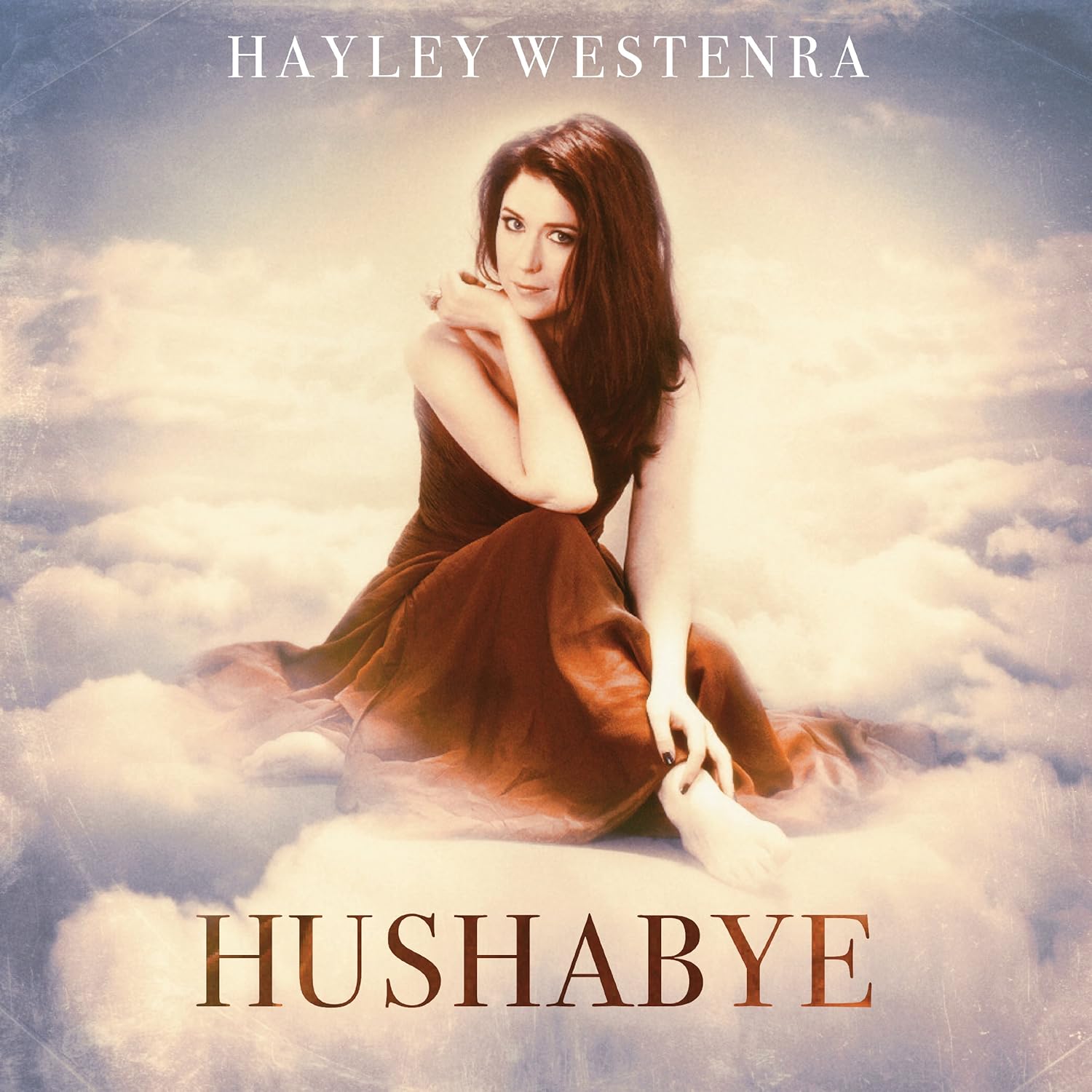
The album cover for classical artist/ singer Hayley Westenra's 'Hushabye' is a good example of the representation of classical artists. The CD cover conforms to the image of classical music being quite ethereal in nature, hence the clouds and 'heavenly' background lighting. The actual cover is fairly simplistic, the font is bold and the name of the album stands out. The shot of Hayley is common of most CD covers as it ensures that the artist is centre of attention, this kind of shot is however usually a close-up, but a long shot is required for this CD cover to emphasise the background. Although this is a typical classical album cover, I find it to be a bit dated and mundane. Therefore I would like to add a contemporary twist to my own digipak, with influences from other genres as well as classical to give my album cover a more modern, colourful look.

The album cover for classical singer, Josh Groban's 'Stages' is of great interest to me. The cover both conforms to, and subverts stereotypes of the genre. The cover features the artist as the main focal point, a common feature of the genre which is seen across the classical and other genres. The cover takes on a modern element that is not typically associated with classical music, through the contemporary use of streaked lighting and background photography of a building and lit sign to reinforce the modern nature of Groban's work, Groban is a classical artist who has modern influences from other genres such as pop and rock, and his album cover is designed to convey this, and  the modern nature of his work. This modern twist on a more traditional genre is what I would like to convey through my music video and digipak.


Album covers of a different genre - Pop 


Album covers of the pop genre all seem to have the same effect. The cover usually always features a close up of the artist, Selena Gomez's album is no exception to this. However, the rain effect, merging of lights in the background is a clever use of convergence which directly relates to the title of the album, 'A Year Without Rain'. This cover is fairly simplistic, I particularly like the font style and size, it has been placed well so as to just touch Gomez' shot but doesn't overpower it. The contrast of colours through the font ensures that the album title stands out, this tends to be a generic convention of the genre and most album covers use a different, vibrantly coloured font for the album name.


Miley Cyrus' cover for her hit album, 'Bangerz' is vibrant and reflects her alternative style/ persona. A suggestive long shot of Cyrus has been used as the main feature, Cyrus ensures that she is the subject of the male gaze given her provocative stance, and the bright red lipstick which draws the audience to her lips - this could be to conform to generic conventions of the music industry, or as a way of utilising stereotypes for promotional gain. The album cover is brightly coloured to grab the audiences' attention and the vibrant colours and trees in the background give the cover a tropical feel. Cyrus has used bold mutli coloured font for her name, the album title is made to stand out by being written in a fluorescent type and being bright pink so that the eye is instantly drawn to this.


Album covers of a different genre - Rap


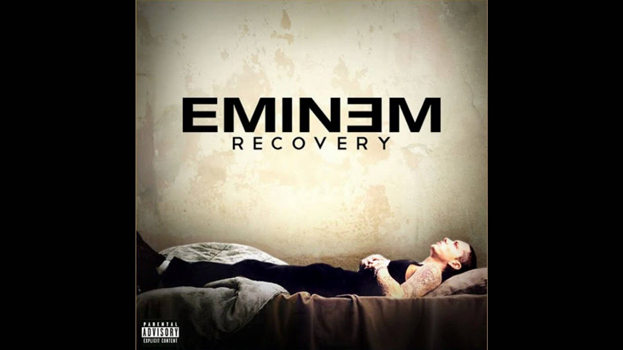
The album cover for Eminem's 'Recovery' is not a typical representation of the rap genre. Usually a rap artists' cover will feature a close up of the artist, but will portray the artists' status and lifestyle through expensive gold jewellery and a powerful stance. Eminem's album on the other hand is a total juxtaposition of this, Eminem is not positioned centrally in the shot but the focus is on his name and album title.The album cover reflects the nature of Eminem's songs/ lyrics on the album. The album details Eminem's recovery from a drug and alcohol addiction, this is reflected in the set of the cover and Eminem's contemplative stance.    


Kanye West's album cover for 'Graduation' does conform to the rap genre. The cover is brightly coloured, the artist's name and title of the album stands out. It is unique with the representation of the bear, although this is a continued theme across Wests' work and was seen on his album 'The College Dropout' also. The typical features of a rap album, exemplified in this work of West, is the need for a disclaimer in the bottom left corner of the album. The need for this label, detailing that 'Parental Advisory,  Explicit Content' is needed for the audience, to inform that strong language, and references to sex, drugs and violence are frequently made within the rap genre - whether the artists' experience of these things or their rebuking of them, it is a safe guarding requirement for both the artist and consumer.


The Original Artist

Ludovico Einaudi

The artist whose work I will be using is Ludovico Einaudi. Einaudi is a an Italian pianist and composer who works as a mainly classical composer, but incorporates elements of different musical genres such as pop and rock into his pieces to keep his music relevant. Einaudi has a large online presence. Einaudi has a very informative, extensive website which gives his fans lots of information. The website is in Italian, given Einaudi's nationality, but this is not an issue as google automatically translates all writing to English. 

The link for Einaudi's website is below; 


The website is fully functional, it is well set up with clear topic headings and sub headings to take the viewer to different sections. 
Einaudi has a live feed with news of concerts, upcoming albums, tours, Television appearances and events that he will be attending which is a vastly beneficial feature. 


There is a section on the website which is entitled, 'Bio' this consists of his family background, experience in the industry and influences for his music.


The contacts section of the page allows the audience to contact his management for bookings and different concert offices. 


The music section has links to the albums available to buy, the score music which can be bought to play, the soundtracks/ scores and videos on Youtube which Einaudi has composed for, and lastly a list of Einaudi's works. 

Lastly, the media element of the website, has links to photos, a discussion forum for fans, a press section which details Einaudi's reviews/ interviews and videos of Einaudi's such as interviews and time lapses/ performances. 


The website contains informative videos such as this which give a behind- the -scenes look at the artist. The clip above contains Einaudi explaining the inspiration behind his new track, and playing exerts of it for the camera. 

Interviews with the artist

The music blog, 'The Seventh Hex' interviewed Ludovico Einaudi regarding his album, 'Elements' published in August 2015. The interview discusses the creative process which allowed Einaudi to create his newest album; how Einaudi is inspired by other artists and how, despite his massive success he tries to stay true to the simple idea of communicating emotion through his music, that he used in the beginning, and throughout his career. 


Please follow the link to the full interview below,


Einaudi has often been interviewed in other forms of media, such as online in magazine articles and newspaper spreads. To promote his newest album 'Time Lapse', Einaudi was interviewed for the Times, whereby he was called "The inventor of 'atmospherica'". The interviewer also noted how Einaudi brings a fresh, modern twist on classical music, which makes it relevant to the music scene, Adam Sweeting noted that, "somehow Einaudi’s music manages to bridge the gap between old-fashioned melody and harmony and the teeming rootlessness of this confusing 21st century"


Social Media Presence 

Part of Einaudi's relevance to modern society is his interaction with fans via social media. Einaudi has utilised this tool to his advantage, having various pages and accounts such as Twitter, FaceBook, Soundcloud and a YouTube account. For example, the image below is a screenshot of Einaudi's Twitter page which he uses for promotion and updating fans with the latest information about his concerts. 


Original Video

The song that I have chosen to use for my music video is 'Nuvole Bianche' (meaning 'White Clouds). The track has no official music video, given its classical nature, I feel that this is a benefit to my work as there can be no direct comparison between my video and an original. The videos for the song on YouTube which has been created by fans, often feature natural imagery. The video which is connected to the link below, is interesting as the creator has used time lapse scenes of natural settings to create a beautiful landscape which accompanies the song. Moreover given how the song I have chosen is slightly unusual in that there is no vocal accompaniment and therefore no lyrics, I have attached the sheet music to give a visual representation of the song. 
The sheet music for Nuvole Bianche

Screenshot from a fan made video 

Final Song Choice

Ludovico Einaudi - Nuvole Bianche 

After considering the songs in my short list, I have decided to do a music video for Ludovico Einaudi's 'Nuvole Bianche'. I have chosen this song for numerous reasons. Firstly it is different, it is quite unusual to do a music video for a classical song but I feel that it gives me a unique opportunity to make an interesting video, which conforms to the generic conventions of the genre and adds a modern twist to what is usually considered an old fashioned genre of music. Equally I love the song as it builds, the song allows for a change of pace in editing, and is perfect for the initial ideas that I have for my music video as it would fit a performance/ narrative based video. This song will present me with a challenge as I will have to storyboard extensively to ensure that, given the lack of lyrics it does not become repetitive or 'boring'. I am however very excited to start work on my music video and will do so next by researching the original artist behind the track.    

Friday, 2 October 2015

Song Choice

Having researched thoroughly the different elements of a music video, and what makes a successful one, I am now deciding which song to use for my own music video. I have narrowed my decision down to 4 songs which I like, and in the post below I hope to list what attracted me to these songs/ videos, and which I feel will best suit the ideas for my video.


One of the songs that I am considering using for my music video, is John Legends' 'All Of Me'. This is a ballad and features the heavy use of a piano, this is of particular interest to me given my desire to have a piano as the main feature of my video. Equally, the emotive lyrics of the song, would allow me to use a romantic narrative which I had considered alongside the performance elements of the video.  


I love James Bay's song 'Hold Back The River' as it builds and would be a great track for cutting to the beat. The song has a folk sound and I like the lyrics, as I feel that they could fit with the ideas I have initially for my music video. The only negative I have for the song is that, although there is a piano part, it is not as strong a feature which may conflict with my idea for the video. 


In contrast with the other, contemporary songs I have considered, I am also looking at music of a different genre - classical music. The song above is Ludovico Einaudi's 'I Giorni', it is a modern classical song which is extremely popular. At its time of release, the song gained recognition after Greg James played it on BBC radio 1 in 2011, it then debuted at 32 in the UK Singles Charts. I particularly like this song as it is unusual, it is not a classic pop song and I could envisage it fitting with my ideas for my music video. My only concern for this piece is that, although a beautiful piece of music, its gentle nature amy become monotonous.   


Lastly, the other classical song that I have researched is again by Ludovico Einaudi, and is entitled 'Nuvole Bianche'. The reasons behind my interest in this song are significant, unlike 'I Giorni' the song builds and is exciting, I feel that it does not become monotonous and I can imagine it keeping the audiences' attention for the allocated time. Moreover, Einaudi has composed scores for film and I feel that the song has the sound of a track that would accompany a key scene of a film. Subsequently, the lyrical melody of the song evokes a narrative quality by nature, and would therefore be perfect for what I have imagined for my music video. This includes elements focusing on nature, with a cinematic narrative and the key feature of the music video would therefore be the use of the piano. Equally, given the classical nature of the song, there is currently no music video to accompany it, this gives me greater creative control in what I can use for my music video, and means that I do not have to avoid copying the work of the original. Finally, 'Nuvole Bianche' would allow me to subvert conventions of the genre as the song would not use frequent cuts to the beat, but long takes and continuity editing, giving it more of a short film feel.