Showing posts with label google images. Show all posts

Friday, 4 March 2016

Putting together the digipak


There have been multiple changes that I have made to my digipak, having been predominantly using Photoshop to put my digipak together I then switched to the program Indesign which is far more effective and gives a more finished and professional finished product. The above image is the format that I had been using, a template from Google, whereas I have been able to use the 'compact disc' feature of Indesign which creates the C.D. booklet format automatically. 


The above image is the initial double page spread that I was intending to use within my digipak. The lack of lyrics to my song, being a piano track, was slightly unusual as this is typically a common spread within digipacks, I therefore attempted to develop this convention by layering sheet music over the top of my image. However, on closer inspection I feel that whilst a good idea, in practicality this does not look as professional as I would like, and has no correlation with the rest of my digipak - thus whilst I am using the image as it does match my natural theme - I will not be layering the sheet music over the top.


I then experimented with multiple images to ensure I had the right images for my digipak, I decided not to include this image as in the digipaks I have researched they often include multiple pictures of just the artist to enforce the brand, therefore I decided not to use this image as it is a two shot and I feel that my target audience would be confused as to why I have included my artists' partner in the shot.


The above image shows the design process and my work within Indesign, my original images did not fit the template of the programme so I had to edit the images in Photoshop. I changed the size of the image, adding more sky to the image to ensure that it filled the space and used the blur and smudge tool to allow a natural gradient. Equally, I was able to increase the resolution of the images which allowed me to keep the font style and colour that I originally used when I placed the images in Indesign. 


Whilst my front and back cover are finished, I am adding the final touches to the inside double pages to my digipak. The above image shows the tree shot which I had originally layered sheet music over. I feel that this image is effective given the silhouettes and shadows created by the bleaching effect of the sunlight - the image also conforms to my classic/ naturalistic theme and I have referenced the inspiration behind it in a previous post. I have left space opposite the image for writing as I am conforming to conventions of a digipack to make my own realistic, therefore I will be using an acknowledgement page.


This is the final double page spread of my digipak, I have used a classic head and shoulder shot of my artist, as I have seen in the digipaks of popular artists such as Rihanna, Ed Sheeran and Beyonce. I believe the image to be effective given its simplicity, there is synergy between this and the previous image given the link of trees and nature/ natural landscapes. I have left space on this image also for writing to conform to the conventions of the genre, on this double page spread I will do either a profile/ meet the artist which replicates what my original artist has done within his own digipacks, or a letter to the fans - I feel that a letter to the fans may be more beneficial as this builds a relationship between the artist and the fans, gives a more personal feel to the digipak, and allows me the opportunity to use Photoshop to create a signature for my artist.   

Wednesday, 10 February 2016

Marketing - My artist and inspirations

When putting together my digipak it was important that I took influence from my artist. Ludovico Einaudi is clearly passionate about nature and elements of nature/ this form of photography feature heavily on his albums, therefore a way of connecting my created artist to the original artist is through encompassing a part of this natural theme into my work.

 The above image is the album cover of one of Einaudi's albums, 'In a time lapse' this and the images used by group 'Kodaline' have influenced my work and I therefore have included the below image as one of my double page spreads in my digipak as a tribute/ emulation of their work - but will be adding my own twist to reflect my artist and music video.  


This image is one of the double page spreads for my digipak, it is very much in the style of Ludovico Einaudi and Kodaline, however I have added my own individual style to the image, playing around with the curves and levels in Photoshop. Moreover, I have since placed sheet music over the top of the image, lowering the opacity so that the shot can still be seen, whilst hopefully appealing to the audience as an additional feature to the digipack will be the opportunity to play the song themselves. Having looked at Einaudi's digipacks I have noted the synergy and the way that my original artist has utilised various forms of media for self promotion - this led me on to consider the marketing of my artist and music video. 

When researching Ludovico Einaudi originally I wrote a blog post on his social media presence and website,
In the post I noted that Einaudi has a large presence online, he has an extensive Facebook and Twitter page, a great website and Itunes/ Spotify page, as well as more traditional marketing techniques such as posters. This form of marketing is used my most artists and I therefore have begun to create an online presence for my artist as this is a vital way of creating a fan base/ connecting with the fans, as well as being fantastic for self promotion. 


 The above image is a screen shot from the Facebook page I have created for my artist! It is a public page which states my artist as a musician and allows the fan to interact by messaging, liking and commenting on my artist's post. The power of social media is vastly evident from Adele's recent success (as is detailed in a post on my blog) and is a tool which practically all artists utilise. The benefits of social media are that it is free self promotion and is used by the majority of my target audience, I have used the album cover as the profile picture to further promote my album, and the bio states that the release date of the album is upcoming, to draw the fans' attention and create hype.


The final image shows some of the activities and features of my artists' Facebook page. I have created posts to interest my fans and promote the release of my album, I have shared a 'sneak preview' photo of the creation of my digipack to interest fans, as well as announcing the forthcoming release date of the album 'Changes' and sharing a location that my artist will be performing at, encouraging fans to come and meet my artist - these are techniques of advertising that I have recreated that are used by popular artists on social media. My artist will have used a mixture of free self promotion through social media, as well as the more traditional release of an album poster, this mixture of marketing is I believe conforming to the norm of the music genre and would help my artist to increase in popularity and expand his fan base.

The below link is for my artist's Facebook page, please feel free to have a look! 

Friday, 29 January 2016

Digipak - the inside

I have also been working on the inside/ leaflet section of my digipak. I researched this section of the digipaks within my earlier posts and know therefore that it is important for the inside of the digipak to grab the audiences' attention and provide more information and insight into the artist/ album. Traditionally, many artists would include photographs which match the album cover for the inside leaflet and include the lyrics for their songs over the top, however as my track is purely a piano track I have needed to be more creative and find alternative information to include in my digipak.  


The below image is a screen shot of the editing process using Photoshop to create my first double page spread for my digipak. I decided to include a double page spread which includes the sheet music for the track of my music video, I thought that this could be an effective way of drawing in fans as there is the opportunity for the fan to play the track themselves, and it also conforms to the feature of digipak albums - to look creative and promote the artist/ build up a fan base.


I have used a photograph I took whilst on location and filming the music video to feature as the background for my page, to ensure that there is a sense of uniformity. I like the image as it fits with the theme of my album front and back cover of nature and light, I edited the image using the curves tool to really bring out the silhouettes of the leaves on the tree in the style of one of the artists who inspired the look of my album - Kodaline.


The final image shows the finished product of my first insert to my digipak. In order to achieve this, I layered copies of the sheet music to the track on my original photograph. I used various different features of Photoshop such as pasting the sheet music to a new document, resizing it manually to fit the size of the photograph and then dragging and dropping them into the same image. To create the finished effect I significantly reduced the opacity of the music so that whilst the notes are visible, so to is the image behind, I also used the text tool to write the artists' name and album title on the page, I used a different font that I felt reflected the nature of the image to add some variety to my digipak. Overall I am very pleased with this image, as I believe that it reflects the conventions of the digipak genre, whilst being slightly different to the traditional layering of lyrics.

Friday, 22 January 2016

Digipak Progress - Back Cover

Within my lessons this week I have been working on the back cover for my digipak album. I have been working on two different images as I am torn between them, and have therefore created an entire back cover for both and will then compare them to get the right look for my digipack. In order to create an effective back cover I reviewed my post on digipaks and identified the different elements of them, what is necessary to make cover authentic, and what I most liked or disliked to ensure that my cover is finished to the most professional standard possible.  


The below image is one of the possibilities of my back cover for my C.D.  To achieve the colour of this image I experimented with the level and curves, I particularly liked this setting as I feel that it heightened the use of the colour and brings out the intricate silhouettes of the tree. I also used the text tool to create the script descending vertically down the side of the cover, I attempted to blend the colour of the writing with the colour of the sky to match my naturalistic theme. Equally, I have decided to have synergy between the front and back cover by using the same font of writing.What I didn't like about this was that I felt the image was slightly too large, and may be better suited as a result to a double page spread within the booklet.


As I continued to edit the image, I cropped the size of my photo to better match the look of an album cover, I do feel that it looks far better like this however I am still unsure. Having researched other back covers I knew that I needed a bar code, this was rather a lengthy process but the final look is far more professional. To get my bar code I copied and pasted an image of my original artists' back cover into photoshop, I then cropped this down to just the bar code and resized the bar code to match my image, having done this I was able to drag and drop the bar code into my back cover file and move it around until I found the correct position.    


Having repeated the bar code process for some other vital components of the cover, the last stage was for me to use the text tool to add the name of the tracks. For the titles of my songs I took inspiration from my artist, the theme of nature and of love so the tracks are a mixture of the original artists' songs 'Nightbook' to my made up names 'Changes'. For the text of my tracks I used the same formal style font and the same kinds of colours as the text at the side of the image. However, I had a real problem with ensuring my font was visible, and as can be seen from the image the font is barely visible, as the mixture of light and dark within the image meant that no natural hues and tones stood out - as a result of this and my hesitance at the relevance to my theme i have discounted this image and worked on a different final image.  


The above image is the alternative photo that I had for my back cover. I feel that this picturesque, natural, image and colour palette mirrors the front of the album, creating a greater sense of synergy and mirroring my front cover. The process for adding the the bar code was exactly the same, and I also have used the logo of a record company as is necessary to make my back cover credible. Having researched various companies thoroughly, I have chosen to use Decca Records as my record company. Decca Records is a subsidiary of Universal Music Group, one of the big 3 and I feel that this smaller subsidiary best fits my artist and video as they are a slightly more niche/ instrumental part of the company whilst still being hugely successful popular, and accessible to a modern audience/ my younger target audience - producing artists such as country duo 'The Shires' and my original artist Ludovico Einaudi - http://decca.com/artists/.    


Another vital element to my cover which I discovered when researching is the small print that rests below the logo of the record company - the declarations. This writing provides vital information to the audience, it contains the year the C.D. is printed, references any co writers of the album, the record company information and a statement prohibiting illegal file sharing and copyrighting. The tool that I used to create this was the text tool, using a slightly less formal font and in the colour grey, as the covers I researched use a different colour to stand out, the writing is extremely small as it is  not supposed to feature prominently on my cover but is more of a formality which adds to the professional nature of the cover. My cover was almost finished at this stage, as I was able fortunately to drag and drop the bar code, Decca logo and small print from my previous discarded image. Therefore I was trying to get the balance of text and colour right of the track listing and side text for the spine of the C.D. - as can be seen from the image i was still struggling with the lightness of the image to make anything stand out.


The above image is my final copy of the back cover for my album which I am very pleased with. I was able to overcome my problems with colours by continuing to research other artists' album covers. What I did was to duplicate my layer and then create a rectangular shape within the tools of Photoshop, and fill this shape using the paint bucket. The next step for me was to reduce the opacity of the shape so that my text became clearer, whilst the image is still visible beneath that, I also decided to darken the colour of the text for my track listing which made it really stand out whilst still adhering to the colour palette of the image and still looking natural. Moreover, I used the text tool and same font, with a bright white font to ensure the spine of the C.D.  will stand out, detailing the name of the artist and album. Overall, I am pleased with my finished back cover and feel that it stays true to my themes, and will match the front cover and music video well.  

Tuesday, 1 December 2015

Narrative Storyboarding - Final


The above image is my final narrative storyboard. Using images I have represented the exact feel that I intend for the narrative element of my music video to have. The storyboard details each individual sequence of the video, and I hope to find it useful to refer back to when filming. I detailed the storyline of the sequence within my draft of this storyboard, but it is designed to have a romantic feel overall which will hopefully fit well with the music, and the performance sequence. The storyboard details the more intricate elements of filming, stating not only the shot I intend to achieve, such as wide shots, over the shoulder shots, but whether it is to be a high or low angle, and also whether/ how it would transition to another shot or image. The idea that I have for this narrative sequence, is to layer certain shots over the main feature of my music video - the artist playing the piano, to convey how they are connected, and I will experiment with light and opacity to give the narrative sequence an almost ethereal quality. I have seen this layering done in more modern music videos, such as Taylor Swift's 'Style' and it is very effective, but hopefully this will as give the video my desired contemporary feel, and ensure the video does not become repetitive, but connects with my predominantly 'young' target audience. Lastly, whilst I have planned the narrative sequence on one storyboard, there are several sequences within it that require different locations and props, especially the home movie sequence which requires an old movie camera, and I will therefore strive to film as much as possible, whilst keeping in mind that I may need to film the narrative element of my video in two halves.

Wednesday, 18 November 2015

Performance Storyboarding

I have now concluded all my research into digipacks, artists, directors, generic conventions, genres and my target audience. I have begun to plan the filming of the performance element of my video, I did this by creating a large storyboard with pictures and annotation to visualise exactly what I will be doing, how the shot will look and what kind of camera angle I need to use.


I have used a variety of images to demonstrate what I want my video to look like, I have planned to do a time lapse for the opening of the video, running into an establishing/ wide shot. The video is then a mixture of shots typically associated with the genre, close up sequences of the artist playing and of the keys, extreme close ups, mid shots, side angles, over the shoulder shots and panning of the landscape to create an effective video.


This element of the video has no storyline and is purely performance based to focus on the artist, and ensure that he is the main focus of attention. The setting is romantic, which I feel reflects the nature of the song and will match what I have envisaged for the narrative sequence. In the same way that another artist may lip synch to their music video, my artist will pretend to play the piano as the organ cannot be played without a power source - and I will layer the song over the video footage that I will take, for the full effect.

Wednesday, 11 November 2015

Target Audience Research

Whilst planning my music video, it is vital that I understand my target audience, so I am able to know how best to appeal to them. I will research the original artists' target audience, then contrast this with contemporary/ classical artists who my style of digipack and video will be similar to, to asses who will be my target audience. I will compile this research into questionnaires and data to help me better process the likes and dislikes of my audience.

Ludovico Einaudi's target audience is difficult to define, although his age and the classical influences of his music may suggest an older audience, the reality is that his music is appreciated by people of all ages and situations. An article from The Sydney Morning Herald, written by Kathy Evans explores how Einaudi's target audience has changed. The nature of Einaudi's music and contemporary influences, the mix of genres that he uses from pop to blues means that he is more accessible to a younger generation.  


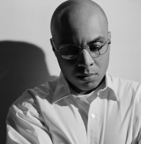
Within the article, the journalist notes Einaudi's love of combining classical music with more modern genres, his love of 'Coldplay' is noted and his own classic look of all black clothing and glasses which are his trademark. The article is interesting and has shown me that Einaudi's music will most likely attract a range of people, therefore I am interested to see the results of my own questionnaire. The link for the full article is below,

http://www.smh.com.au/entertainment/music/crossover-king-finds-a-new-audience-for-his-classical-music-20140202-31uvr.html


Consumer information surrounding classical music

When conducting my target research I felt that it was important to discover how consumers relate to classical music as this will be vital to the reception of my music video. I have referenced below a study that I found online conducted by the 'John S and James. L. Knight' foundation and a collaboration of American Orchestras. Despite the fact that the study is specifically regarding American audiences, I believe that there is still valuable and relevant information to be taken from this. 

Please follow the link below and scroll to page(s) 41 and 42 to find the information that I looked at and processed. 

http://cuttime.com/wp-content/uploads/2014/08/2002_classical_music_consumer_report.pdf    - scroll to page 41/ 42

I believe that the key information of the study regarding the relationships between the audience and classical music, can be summarised in the following quote; "Overall, consumers have highly personal, complex and multi-dimensional
relationships with classical music. For some people — those most involved with the
art form — classical music plays out like a sound track to their lives." This quote has shown me that classical music can connect with the audience, and I therefore feel that the cross generational theme of my video, and narrative storyline will adhere to this and should hopefully make an interesting and emotionally evocative music video.


My Research - The Questionnaire


As part of my research into my target audience, I have created a questionnaire designed to ascertain what likes and dislikes my audience have. I have asked a range of questions to determine my audience, such as age and gender, as well as questions about my song's genre, the audience's preference for music videos in regards to content and mise-en-scene. The most crucial question for me is whether or not my audience is willing to embrace different genres than perhaps what they might usually choose to listen to, and be open to a "classical music piece set to a more modern/ contemporary music video".  

Having created my questionnaire, I will now conduct the research and process the results within my next post.  

Wednesday, 4 November 2015

Permission


Having chosen a song that I love and would like to use, it is vital that I get the original artist, Ludovico Einaudi's permission for me to use his work to avoid any issues with copyright, ownership and plagiarism. Einaudi is represented by Decca Records, a subsidiary of one of the Big Three, Universal Music Group. Therefore, having researched the procedure for gaining permission to use a song, I will email Decca Records to ask for permission to use the song 'Nuvole Bianche' by Ludovico Einaudi.


The above screenshot is the email that I sent to Decca Records, the email contained a list of information that is required on the website and I was sure to emphasise that my music video will not make a profit. I also commented that Ludovico Einaudi will be referenced on my blog, and stressed to be the true artist of the song.

-Artist
-Title and Year of Recording
-Link to Recording/Album
-Catalogue Number
-Country Track was published in
-Description of Use


The above list is what Decca Records published on their website as key things to include in the email when requesting permission to use one of their artist's tracks.

I received a reply from Decca Records, I am free to use the song as long as the video is not published in a public domain. Therefore, as a result I will not be posting my finished music video on my blog but it will be copied on to a private DVD. However, I will be documenting the process with regular posts and screenshots.

Saturday, 24 October 2015

Digipak Research - What I liked

After researching the different elements of digipaks, I have compiled below the different elements that I liked and have taken inspiration from. These include things like font style, layout, colour schemes and photography, which i have been inspired by whilst researching other digipaks, and have given me ideas and influenced what I would like to use when it comes to creating my own digipak.
What I particularly liked about this digipak of Kodaline's, was the photography. I love the natural theme which is continued throughout, the feature of light, the technique of bleaching - as this is something that I would like to include in my video and therefore I can take inspiration from this. Equally, I feel that the tree shot in particular is striking and grabs the audiences attention, I do not however like the font as I feel that it doesn't stand out enough in certain shots and blends with the colour scheme as opposed to other covers where the album title contrasts the other colours.


What attracted me to this digipak was the layout and colour scheme. There is continuity throughout the booklet, album cover and CD which I really like and think that the contrast of black and white, with pastel colours is bold and fun. Aplin's digipak certainly stands out, and I also liked the font of the title. The font is bold, block capitals for the artists' name and I like the handwritten effect of the album title, to ensure the album feels more personal - although I feel that the album title font is too small and doesn't grab attention in the same way as the artist's name.


I was drawn to this album cover given its creativity. I like the artistic nature of the shot, which emphasises the importance of the artist. Moreover as well as the photography, I was drawn to the editing technique in the colour and lighting of the shot. The slight bleaching and out of focus lights, makes the image of the artist glow which I thought was interesting and different. The album cover is by an artist of the classical genre, and this appealed to me as it is classical with contemporary influences - which is what I intend to mimic in my own digipack and music video.  


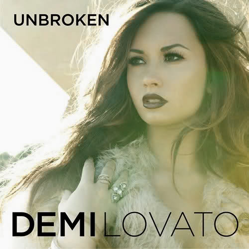
I like this album cover/ digipak as the font and colour scheme caught my eye. The font is big, bold and the artist name and album title really stand out, I think that the graduation of boldness in the artist name is an effective technique also and looks creative. Equally, the dark purple colour scheme is continued throughout the image, the colour matching Lovato's lipstick colour, eye make up and font colour - creating a sense of synergy.


Lastly, what I liked about this album cover was the photography. I think that the artistic nature of the portrait shot is effective in establishing the artist and ensuring that Bieber is the centre of of attention. I think that the cover is well shot and the album title certainly stands out, creating a contrast with the more traditional black and white theme. The only thing I am unsure of, is the size and positioning of the artist's name as I feel this does not really stand out as significantly as the album title.

I have researched digipaks of different genres and reviewed in particular what specific features I liked. Overall, I have found that the size of font is very important, colour schemes should contrast in some way to stand out and grab attention, whilst retaining a sense of continuity. As some kind of link between the image, font and colour scheme is vital in creating a sense of synergy for the artist and presenting my digipak as a viable product.  

Tuesday, 29 September 2015

Media Products Which Have Influenced Me/ My Video

Whilst researching artists, videos, directors and theories I have also compiled some other media products which have influenced me and that I have taken inspiration from, and would therefore like to incorporate into my music video.


 Album Covers

I have been influenced by the media product of album covers. Album covers come in a variety of forms, lots of albums use artwork or a typical shot of the artist, however I was influenced by these two album covers as they are different to the norm. I specifically liked Katy Perry's 'Prism' album cover given the combination of a usual shot of the artist and the interesting use of bleaching and colour in the background which gives the cover a creative feel. Equally, I enjoyed the creative nature of Ben Howard's 'Every Kingdom' as it is alternative to the typical album cover and the use of water and lighting give the cover an ethereal feel. Overall I was influenced by these media products as they subvert the stereotypical 'headshot' image used on an album colour and I would like to experiment with lighting and colour to make a creative album cover when it comes to making the digipack for my own music video. 


Creative Videos

I researched creative music videos and found that I was influenced especially by a certain few, the video for Naughty Boy ft Beyonce and Arrows' 'Runnin' is massively popular already for its alternative nature, the video has been live since the 17th September 2015 and already has over 12 million views on Youtube. I have enclosed below the link to the video - please watch!

https://www.youtube.com/watch?v=1RNftSQj4cM

 These screenshots capture what I found so influential about this video. The video has a transfixing quality and the audience cannot look away, the unusual use of nature and the sea is mesmerising and produces a beautiful effect, in terms of the use of movement, colour and lighting which I found to be particularly effective and influenced me to want to involve nature in some way within my music video.

Moreover, alongside the spectacle nature of the video is a narrative storyline which is demonstrated in this screenshot. The video influenced me as despite being so creative it was also able to portray a strong narrative/romantic storyline which gives the video an added depth and it therefore conforms to certain generic conventions of the genre - although the slow pace of the editing and lack of frequent cuts give the overall appearance of a short film, more than a traditional music video.

I also enjoyed the alternative and creative nature of Taylor Swifts' newest single, 'Wildest Dreams'. The video has been live since the 30th August 2015 and currently has over 84 million views. I have posted the link below, please watch

https://www.youtube.com/watch?v=IdneKLhsWOQ

The video for 'Wildest Dreams' is unique for its extensive narrative sequences and exotic location. The video follows a 1950's movie star theme which is carried throughout, but the parts of the video which influenced me most were images like this; the focus on lighting and filming with the setting of the sun combined with bleaching gives an interesting lighting effect which appealed to me.


The last creative music video I researched is Justin Bieber ft Skrillex's 'Where are you now'. The video was posted on the 29th of June 2015, and has over 180 million views on Youtube, the most of all the videos I have researched and the unique nature of the video is evidently why. The link is posted below - please watch.

https://www.youtube.com/watch?v=nntGTK2Fhb0


The video for Bieber's 'Where are you now' is especially unique given its experimentation with animation and CGI. I particularly like the creative element of this video, in which there is an animation sequence whereby the audience can stop the video at any time and a different drawing on Bieber's image as seen in the screenshot can be viewed.

The video also focuses on lighting and using this in different ways. I especially enjoyed this sequence of the video because of the use of a projector to create a new image, like an overlay on top of the shots of Justin. The combination of projector and overlay allows for a new image to be created - an artistic outcome of paint splatters and pattern is produced which is an unusual element of a music video.


Adverts


Certain adverts, although not for music videos have influenced me also. The full advert for Chanel, 'Bleu Du Chanel' is directed by iconic movie director Martin Scorsese (who has also worked with artists such as Michael Jackson) and is interesting given its narrative theme throughout. The reason this advert, and others like it have influenced me is the use of a flashback sequence, incorporating lots of post production editing techniques such as ultra violet, bleaching, black and white filters extc. to give a nostalgic feel to the main characters' memories.


I have also enjoyed and been influenced by the narrative nature of other adverts such as the galaxy advert, which uses CGI of Audrey Hepburn to promote the product. However, what I enjoyed most was the narrative storyline within the advert, this too is what I enjoyed about the Chanel no 5 advert, combined with the high key lighting and cinematography. I have posted the links for both of these adverts below.

https://www.youtube.com/watch?v=gx9eDoS76LM

https://www.youtube.com/watch?v=8asRWe5XNw8

What I have taken from my research into the adverts that have influenced me, is that I feel a narrative storyline is particularly enjoyed by the audience, and is what I hope to incorporate in some way into my own music video, as well as experimenting with and focusing on lighting and colour.


Type of music - The genre/ sound

Within my music video, I intend to use a piano as a key part of the video - therefore although I have not yet chosen my song I know what kind of music I will be looking at to fit my vision. The kind of music that has influenced me in this project, and I feel will best fit the ideas I have my video is more classical / ballad/folk like than say a pop song. The type of artist who I envisage fitting this sound are male artists like; John legend, Ed Sheeran, Ben Howard, James Bay and George Ezra, whilst the female artists I would associate with this would be artists such as; Taylor Swift, Rachel Platten and Gabrielle Aplin. 


Friday, 11 September 2015

Music Video Directors

The directors of music videos are massively important and they help enable the artists' vision come to life. To replicate a good music video, when it comes to making mine it is important to research the directors and their work to see how they put the piece together. I will be looking at the top rated music video directors, big names who famous music artists use, to view their work and see why they are so popular.

1. Paul Hunter


Hunter has worked with many high profile clients such as Michael Jackson, who he directed a video for on his last album, Hunter also directed the video for the hit 'Lady Marmalade' featuring Christiana Aguilera, Lil' Kim, Mya and Pink.

https://www.youtube.com/watch?v=RQa7SvVCdZk
The video is very well choreographed and follows the intertextual theme of 'Moulin Rouge!' as it was used within the 2001 film of the same name.


2. Hype Williams

Williams is a much sought after director who has worked with many stars and directed the massive hit by Daft Punk ft Pharrell Williams - 'Get Lucky' which remained at number 1 for over 5 weeks.

The video is intertextual, taking elements of performance and video game style animation - making the overall appearance of the video artistic and alternative, although it still has a classic feel given the performance shots of the band and Pharrell in suits which seems to replicate the artists of the 80s such as within the Police's 'Every Breath You Take'.


The classic performance shots of Get Lucky
The animation segments of Get Lucky


3. Anthony Mandler

 Anthony Mandler is an extremely popular music director who works with big stars and produces very artistic but classic works, such as JayZ and Justin Timberlake's 'Holy Grail'. Mandler has worked particularly with Rihanna, collaborating with her on 16 music videos - more recently they worked together on her number 1 hit, 'Diamonds'


The video for 'Diamonds' has a distinctly cinematic feel, the shots of landscape and a horse galloping captures the audiences' attention. The entire video is a mixture of performance and narrative, with Rihanna performing to the camera in different locations and the shots of a horse and fire build a sense of turmoil which is contrasted by the calm of Rihanna being submerged into a pool, the song is speculated to be about Rihanna's past unhealthy relationships - the hectic shots of the fire and war zones, and choosing a new path - the shots of her at peace in the pool, this is reflected in the lyrics of the song "I choose to be happy".

4. Spike Jonze

Spike Jonze is not purely a music video director, Jonze is an accomplished film director and his videos therefore tend to have a distinctly cinematic feel.

Jonze's videos tend to be fairly unusual, a key example of this is Bjork's 'It's Oh So Quiet' which has a musical style quality with the artist and back up dancers all dancing and singing in the street, more like a film sequence than a music video.
Equally, another example of this is Kanye West's 'Flashing Lights'. The video is unusual in that it is purely narrative with Kanye West only appearing at the end of the video. Equally, the video does not conform to the generic conventions of the genre given the long takes and continuity editing, a lack of frequent cuts ties the video together making it appear to be even more like a short film. I have attached the link below - WARNING explicit/ graphic content.
https://www.youtube.com/watch?v=ila-hAUXR5U

5.  Dave Meyers

Dave Meyers is a popular music video director who used to specialise in predominantly hip- hop videos during the 90s, started to branch out and became respected for his work with pop videos.
Meyers has worked with multiple artists including JLo, P!nk, Katy Perry, Missy Elliot and Ice Cube among others.

Meyers directed the music video for Katy Perry's 'Firework' which won the VMA award for 'Best Music Video Of The Year'. It conforms to many generic conventions of the genre, the video contains lots of cuts, camera angles and close ups to showcase the artist and her lip syncing. The video is a hybrid of performance and narrative elements. Another generic convention seen within the video is the use of CGI of the fireworks to create a colourful effect making the video interesting and linking directly to the name and lyrics of the song.

Wednesday, 9 September 2015

Generic Conventions Of A Music Video

The generic conventions of a music video encompass various different elements of the video, ranging from the type of video; to fit a certain theme, the camerawork, the editing, lighting and the mise-en-scene.

Camerawork

The generic conventions regarding camerawork are extremely evident when watching a music video.

  • The video will usually contain  a selection of shots and angles to keep the video interesting and varied. The most well known camera angle used for music videos is undoubtedly the close up, or extreme close up of the artist lip syncing which is usually following a long or wide shot of a dance sequence.


An extreme close up from Meghan Trainor's 'Dear Future Husband'
A close up of Madonna's 'Vogue'

  • The other form of camera movement which is a generic convention of the genre is the use of pans, whip pans, crane shots and the use of dolly's for tracking which lets the audience move with the pace of the performer/ dancers.  

Editing 

The editing of a music video can differ massively dependant on what the director wants to communicate to the audience, however the main generic convention is the lack of continuity, switching between artist, story line and instrument is typically of most music videos.

  • The styles of editing; jump cutting and montage editing are usually dictated to by the music itself. Many music videos contain editing which gives the impression of 'jumping' from shot to shot to the beat of the music, although continuity editing (like in Sia's 'Chandelier) can be used also to create a smoother appearance. 
Rihanna's 'Disturbia' is a perfect example of how editing is used alongside the music, each cut matching a beat.


Lighting

The generic conventions of lighting for music videos are fairly extreme as lighting is so key in setting moods, although some music videos choose to have naturalistic lighting to carry a storyline, the norm is to use lighting expressively being either very high key or very low key. 

  • Extreme artificial light, or 'bleaching' can be used on the artists during close ups to give them an ethereal quality which makes them seem powerful and almost ageless
The use of 'bleaching' in Taylor Swift's 'Style' 
  • The use of black and white contrasted with colour for effect on choruses and flashbacks is another popular lighting technique within music videos, as is strobe lighting which is predominantly a generic convention of pop videos. 
Strobe lighting in Jennifer Lopez' 'On The Floor'


  • Lastly, another common form of lighting used in different videos is the technique of CGI to create futuristic sets for the dancer to perform in which fit the theme of their music video. 
CGI as is used in Katy Perry's 'E.T.'


https://www.youtube.com/watch?v=L8eRzOYhLuw  - Please click on the link to view Ariana Grande's 'Break Free' another example of CGI within a music video.

Mise-en-scene

The generic conventions of mise-en-scene contain the elements such as; costume, lighting, acting, make up and props, positioning and setting. The mise-en-scene can be put together collectively to emphasise a theme or storyline within the video.

  • The mise-en-scene of a video may be used to convey a historical theme, this may stay consistent throughout or there may be obvious contrasts in the miss-en-scene to switch between two different settings/ time periods. This use of miss-en-scene to create a time period is demonstrated within Girls Aloud's hit 'Can't Speak French' 


  • Some uses of mise-en-scene within a music video is to create a sense of realism and authenticity, such as a performance video filmed in a recording studio like Justin Bieber's 'Never Say Never'. 


  • The other use of mise-en-scene in a music video is to have particularly beautiful sets/ locations and lots of props and miss-en-scene to confirm the artists 'star' status and show off their lucrative lifestyle, confirming how powerful they are to the audience/ fans.  


Iggy Azalea ft Britney Spears' 'Pretty Girls'