Wednesday, 18 November 2015

Performance Storyboarding

I have now concluded all my research into digipacks, artists, directors, generic conventions, genres and my target audience. I have begun to plan the filming of the performance element of my video, I did this by creating a large storyboard with pictures and annotation to visualise exactly what I will be doing, how the shot will look and what kind of camera angle I need to use.


I have used a variety of images to demonstrate what I want my video to look like, I have planned to do a time lapse for the opening of the video, running into an establishing/ wide shot. The video is then a mixture of shots typically associated with the genre, close up sequences of the artist playing and of the keys, extreme close ups, mid shots, side angles, over the shoulder shots and panning of the landscape to create an effective video.


This element of the video has no storyline and is purely performance based to focus on the artist, and ensure that he is the main focus of attention. The setting is romantic, which I feel reflects the nature of the song and will match what I have envisaged for the narrative sequence. In the same way that another artist may lip synch to their music video, my artist will pretend to play the piano as the organ cannot be played without a power source - and I will layer the song over the video footage that I will take, for the full effect.

Target Audience Research Analysis

The below images are the results of my target audience research questionnaire, condensed into data through the use of pie charts. 


My initial question was regarding the audience's gender and I had a fairly even split within my results, although a slightly higher proportion of females answered my questionnaire. This result was expected as the classical music genre is diverse and does not target one genre over the other, such as say the rap genre which might predominantly target men over women. Therefore I will ensure that my music video appeals to both men and women, to reflect the mixed gender of my target audience.


Age wise, my target audience is between 17 and 25 years of age. This younger age group I think represents several elements of my project. Firstly the age of the artist will naturally attract a younger consumer, equally the contemporary nature of my music video and taking influence from narrative story-lines of music videos from different musical genres such as pop open myself up to a younger demographic. Lastly, despite my target audience being from 17-25 I believe that the diverse nature of classical music means that my target audience could well be broader as it appeals to people of all ages, however I will specifically focus on the younger target audience of between 17 and 25 years of age.


To get an idea of the kind of music that my target audience listen to I used a multiple choice question, as can be seen from the pie chart my target audience listen to a wide range of musical genres. Predominantly though, the most popular genres were: Pop, Rock and R&B - this is beneficial as the narrative elements of my music video were inspired by watching those created in pop music videos such as Katy Perry's 'The One That Got Away'.


This question was pivotal for my idea for my music video, as my song is slightly alternative in that classical music is not always associated with the younger generation and music videos, it was important that my target audience listen to a variety of music, therefore I was very pleased that 100% of my audience said that they do in fact listen to a variety of music and would therefore be more open to my track. 


The result of this question was very interesting to me as I had no option that I was hoping would be most popular with my audience, the audience found the Artist and Location of a music video to be the most important, even above Camerawork. This was slightly unexpected as I had thought that Camerawork would be the most important to my audience, however this shows me that the representation of my Artist and Location needs to be carefully thought out and constructed to give the maximum effect and impress my target audience.


I was extremely happy with the outcome of this question given its importance in the type of music video I am doing. The most popular music videos that my target audience watch/ prefer were Narrative, Performance and Hybrid. This is particularly significant for me as my video will be a hybrid of performance and narrative elements therefore the knowledge that my target audience prefer this type of music video and engage with this the most is encouraging and indicates that hopefully my video will be well received by my target audience.


Again, this question was important for me to know and for my target audience as given that only a small number of my target audience said that they regularly listen to classical music, it is imperative that they are open to music of a different genre. Thankfully, 100% of my audience said that they were indeed open to music of a different genre and therefore will be receptive to my track. 


As I had anticipated there were several different opinions expressed with this question. The typical associations with the classical music genre are for it to be orchestral, instrumental (many people expressed an association specifically with pianos and violins) and emotional. This is good feedback for me as I feel that my track whilst being dramatic and building, it is also quite emotional. 'Nuvole Bianche' has been featured in adverts, TV programmes and film - this can benefit me as the narrative element of my storyline featuring an elderly couple could be quite powerful, therefore there should be a sense of synergy between the track and the music video.      


This was one of the most pivotal questions for me. This was as the concept behind my video is to use a dramatic, building piano track set to a modern music video like those that I have researched, conforming to certain generic conventions of the genre. I was however nervous as to how this would be received as the younger audience that I knew I would be targeting are predominantly listening to more upbeat, pop style music. Therefore, I was very pleased to see that 100% of the people I asked felt that they would enjoy this change, and would enjoy seeing a classical track set to a more modern/ contemporary music video.    


The final question that I asked was regarding the digipack that I will need to create to accompany my music video. It was important for me to find out what element of a digipack appeals to the audience the most. Interestingly, my target audience felt that the photography of the album is the most important element, followed by the artist and colour scheme. I have therefore taken this feedback on board and will ensure that the photography, artist and colour scheme are what I focus on most and ensure are extremely effective - with font style and links to social media playing a slightly smaller role.

My questionnaire was incredibly informative and the results will influence the approach to my music video and digipack - as I take on my target audience's likes and dislikes, to create the best product I can.  
Within my target audience research I did not limit myself to just one form of research, but created more spontaneous 'vox pop' style audio interviews with my audience to get a more 'natural' reaction, whereby I have not guided the conversation but allowed them to express exactly how they felt. I have attached an example of an interview below.


The above link should be live in wikishare within 7 days, so if it does not work, you can download the file quickly as the interview is only about 2 minutes long. 

Within the audio interview the person I interviewed expressed her conformance with the results of my questionnaire. For example,  her favourite type of music was pop and she felt that she enjoys the typical associations of a music video of that genre e.g. being "flashy" with dancers involved. My audience member stated her associations with classical music as being slower paced and quite emotive. Having listened to my track she felt that the emotion of the song and how it built was evident and I was pleased that she seemed interested at the prospect of the track set to a modern, contemporary music video stating that it would be "different from what we usually experience". 
  

Wednesday, 11 November 2015

Target Audience Research

Whilst planning my music video, it is vital that I understand my target audience, so I am able to know how best to appeal to them. I will research the original artists' target audience, then contrast this with contemporary/ classical artists who my style of digipack and video will be similar to, to asses who will be my target audience. I will compile this research into questionnaires and data to help me better process the likes and dislikes of my audience.

Ludovico Einaudi's target audience is difficult to define, although his age and the classical influences of his music may suggest an older audience, the reality is that his music is appreciated by people of all ages and situations. An article from The Sydney Morning Herald, written by Kathy Evans explores how Einaudi's target audience has changed. The nature of Einaudi's music and contemporary influences, the mix of genres that he uses from pop to blues means that he is more accessible to a younger generation.  


Within the article, the journalist notes Einaudi's love of combining classical music with more modern genres, his love of 'Coldplay' is noted and his own classic look of all black clothing and glasses which are his trademark. The article is interesting and has shown me that Einaudi's music will most likely attract a range of people, therefore I am interested to see the results of my own questionnaire. The link for the full article is below,

http://www.smh.com.au/entertainment/music/crossover-king-finds-a-new-audience-for-his-classical-music-20140202-31uvr.html


Consumer information surrounding classical music

When conducting my target research I felt that it was important to discover how consumers relate to classical music as this will be vital to the reception of my music video. I have referenced below a study that I found online conducted by the 'John S and James. L. Knight' foundation and a collaboration of American Orchestras. Despite the fact that the study is specifically regarding American audiences, I believe that there is still valuable and relevant information to be taken from this. 

Please follow the link below and scroll to page(s) 41 and 42 to find the information that I looked at and processed. 

http://cuttime.com/wp-content/uploads/2014/08/2002_classical_music_consumer_report.pdf    - scroll to page 41/ 42

I believe that the key information of the study regarding the relationships between the audience and classical music, can be summarised in the following quote; "Overall, consumers have highly personal, complex and multi-dimensional
relationships with classical music. For some people — those most involved with the
art form — classical music plays out like a sound track to their lives." This quote has shown me that classical music can connect with the audience, and I therefore feel that the cross generational theme of my video, and narrative storyline will adhere to this and should hopefully make an interesting and emotionally evocative music video.


My Research - The Questionnaire


As part of my research into my target audience, I have created a questionnaire designed to ascertain what likes and dislikes my audience have. I have asked a range of questions to determine my audience, such as age and gender, as well as questions about my song's genre, the audience's preference for music videos in regards to content and mise-en-scene. The most crucial question for me is whether or not my audience is willing to embrace different genres than perhaps what they might usually choose to listen to, and be open to a "classical music piece set to a more modern/ contemporary music video".  

Having created my questionnaire, I will now conduct the research and process the results within my next post.  

Thursday, 5 November 2015

Adele - Hello


Although I have decided on my song and have already begun to plan what I envisage for my video, I feel that a post on Adele's new song and video 'Hello' from her album 25 is vitally important in contemporary media practise as she has made such an impact with this piece of work. 'Hello' is the first release by Adele in three years, following the release of 'Skyfall'. Adele was very careful with the marketing strategy for her single, to be followed by the album. The profile of the album was kept low, and was unexpected, a very different strategy to other artists who promote their forthcoming albums on social media and advertising for months before a single is released, for example Justin Bieber's 'What Do You Mean'.


Adele kept the release under wraps, a promotional advertisement of the video was viewed on the 12th October, in an advertisement break of The X Factor on prime time UK television, a clever tactic in of itself given the estimated 6.8 million viewers watching. The clip itself was only a 30 second promo of her new material, as can be seen from the screen shot the clip was very minimalistic containing only the lyrics of the song written in white, to contrast the black background - whilst the audience listened to Adele singing the first part of the song. This was an incredibly clever marketing technique as it built hype, the buzz surrounding Adele and her music was created a full ten days before the release of the song.


This is the only post Adele made on her social media before the release of the song 'Hello', it is so effective given its honesty, Adele connects with her fans through her realism and the personalisation of the letter makes the fan feel connected to Adele and her life - all creating hype surrounding the release of her song/ album. The song 'Hello' was released on the 22nd of October 2015 and broke several records. The result of Adele's marketing tactics and the effect of keeping the audience in suspense resulted in explosive gain for Adele and the video currently has over 222 million views. 'Hello' broke the Vevo record for the most amount of views in 24 hours, with over 27.7 million views, eclipsing Taylor Swift's 'Bad Blood' which previously held the record. Perhaps most impressively is the other record of reaching 100 million views on YouTube within 5 days, a record previously held by Miley Cyrus for the controversial, 'Wrecking Ball'.


There is definitely a sense of synergy within Adele's work, her album covers are a prime example of this as they show a sense of progression. The same style of shot is used, an artistic close up or extreme close up is the focus of the cover to emphasise Adele's status as the artist. The editing of the albums are important also, much of Adele's work and her album covers have a black and white effect, there is convergence between this and the sepia effect throughout Adele's 'Hello'. A black and white effect is very classic, and minimalistic and this has become a kind of motif for Adele, therefore the new album cover is an example of convergence, it is instantly recognisable to fans to be the work of Adele, and is a continuation of Adele's successful 'branding' as an artist.  

Wednesday, 4 November 2015

Permission


Having chosen a song that I love and would like to use, it is vital that I get the original artist, Ludovico Einaudi's permission for me to use his work to avoid any issues with copyright, ownership and plagiarism. Einaudi is represented by Decca Records, a subsidiary of one of the Big Three, Universal Music Group. Therefore, having researched the procedure for gaining permission to use a song, I will email Decca Records to ask for permission to use the song 'Nuvole Bianche' by Ludovico Einaudi.


The above screenshot is the email that I sent to Decca Records, the email contained a list of information that is required on the website and I was sure to emphasise that my music video will not make a profit. I also commented that Ludovico Einaudi will be referenced on my blog, and stressed to be the true artist of the song.

-Artist
-Title and Year of Recording
-Link to Recording/Album
-Catalogue Number
-Country Track was published in
-Description of Use


The above list is what Decca Records published on their website as key things to include in the email when requesting permission to use one of their artist's tracks.

I received a reply from Decca Records, I am free to use the song as long as the video is not published in a public domain. Therefore, as a result I will not be posting my finished music video on my blog but it will be copied on to a private DVD. However, I will be documenting the process with regular posts and screenshots.

Saturday, 24 October 2015

Digipak Research - What I liked

After researching the different elements of digipaks, I have compiled below the different elements that I liked and have taken inspiration from. These include things like font style, layout, colour schemes and photography, which i have been inspired by whilst researching other digipaks, and have given me ideas and influenced what I would like to use when it comes to creating my own digipak.
What I particularly liked about this digipak of Kodaline's, was the photography. I love the natural theme which is continued throughout, the feature of light, the technique of bleaching - as this is something that I would like to include in my video and therefore I can take inspiration from this. Equally, I feel that the tree shot in particular is striking and grabs the audiences attention, I do not however like the font as I feel that it doesn't stand out enough in certain shots and blends with the colour scheme as opposed to other covers where the album title contrasts the other colours.


What attracted me to this digipak was the layout and colour scheme. There is continuity throughout the booklet, album cover and CD which I really like and think that the contrast of black and white, with pastel colours is bold and fun. Aplin's digipak certainly stands out, and I also liked the font of the title. The font is bold, block capitals for the artists' name and I like the handwritten effect of the album title, to ensure the album feels more personal - although I feel that the album title font is too small and doesn't grab attention in the same way as the artist's name.


I was drawn to this album cover given its creativity. I like the artistic nature of the shot, which emphasises the importance of the artist. Moreover as well as the photography, I was drawn to the editing technique in the colour and lighting of the shot. The slight bleaching and out of focus lights, makes the image of the artist glow which I thought was interesting and different. The album cover is by an artist of the classical genre, and this appealed to me as it is classical with contemporary influences - which is what I intend to mimic in my own digipack and music video.  


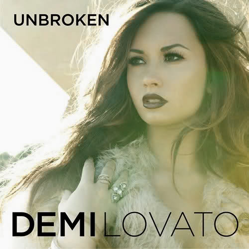
I like this album cover/ digipak as the font and colour scheme caught my eye. The font is big, bold and the artist name and album title really stand out, I think that the graduation of boldness in the artist name is an effective technique also and looks creative. Equally, the dark purple colour scheme is continued throughout the image, the colour matching Lovato's lipstick colour, eye make up and font colour - creating a sense of synergy.


Lastly, what I liked about this album cover was the photography. I think that the artistic nature of the portrait shot is effective in establishing the artist and ensuring that Bieber is the centre of of attention. I think that the cover is well shot and the album title certainly stands out, creating a contrast with the more traditional black and white theme. The only thing I am unsure of, is the size and positioning of the artist's name as I feel this does not really stand out as significantly as the album title.

I have researched digipaks of different genres and reviewed in particular what specific features I liked. Overall, I have found that the size of font is very important, colour schemes should contrast in some way to stand out and grab attention, whilst retaining a sense of continuity. As some kind of link between the image, font and colour scheme is vital in creating a sense of synergy for the artist and presenting my digipak as a viable product.  

Tuesday, 13 October 2015

Digipak Research - Posters

A key part of a digipak is the advertising, or more specifically the album poster.  The album poster is a vital part of the advertising as it is what the audience is most likely to see when out and about, therefore an artist must ensure that it stands out and grabs the consumer's attention to make them want to buy their album. I will make a poster to go with my digipak when creating my music video, and so I am going to research different album posters to see what is effective, and how the artists have promoted themselves.

Popular band The Script's album 'Hall Of Fame' is a classic example of the photography, font and layout which is typical of an album poster. The poster is bold and eye catching, the type of font is consistent across both posters, the font for the band title being more decorative, and the album title and release date being much larger and more of a block font to really stand out. Moreover, the posters are very artistic, the monochrome theme is consistent and the contrast of black and white writing is effective. Equally, the motif of the band is evident form the posters, the leader of the band is clearly Danny O' Donoghue who is featured centrally in both posters, he is positioned furthest forward in the image to the left, and his face is far larger than his bandmates in the image to the right - to connote his importance and superior status within the band.


Below is the album poster for Ellie Goulding's 'Lights'. The poster features many generic conventions of the genre, for example the poster photography is a bust shot of the artist, ensuring she is the centre of attention. The poster has certain key features also, it details the artists' name and album title as the central focus, they stand out due to the luminescent quality to the font which has been enhanced with the use of CGI, to ensure that the writing and Goulding's hair/ background is filled with little lights, this is a clever marketing tool of convergence, as the same message is being portrayed across the album title, album cover, and poster. Another key feature of album posters which Goulding has utilised is the use of positive reviews on the bottom of the album, for example Ellie has used a quote from 'The Fly' stating her album as "A staggering achievement", and awarding her 4 stars - this encourages the audience to buy the album as it is clearly popular with critics.


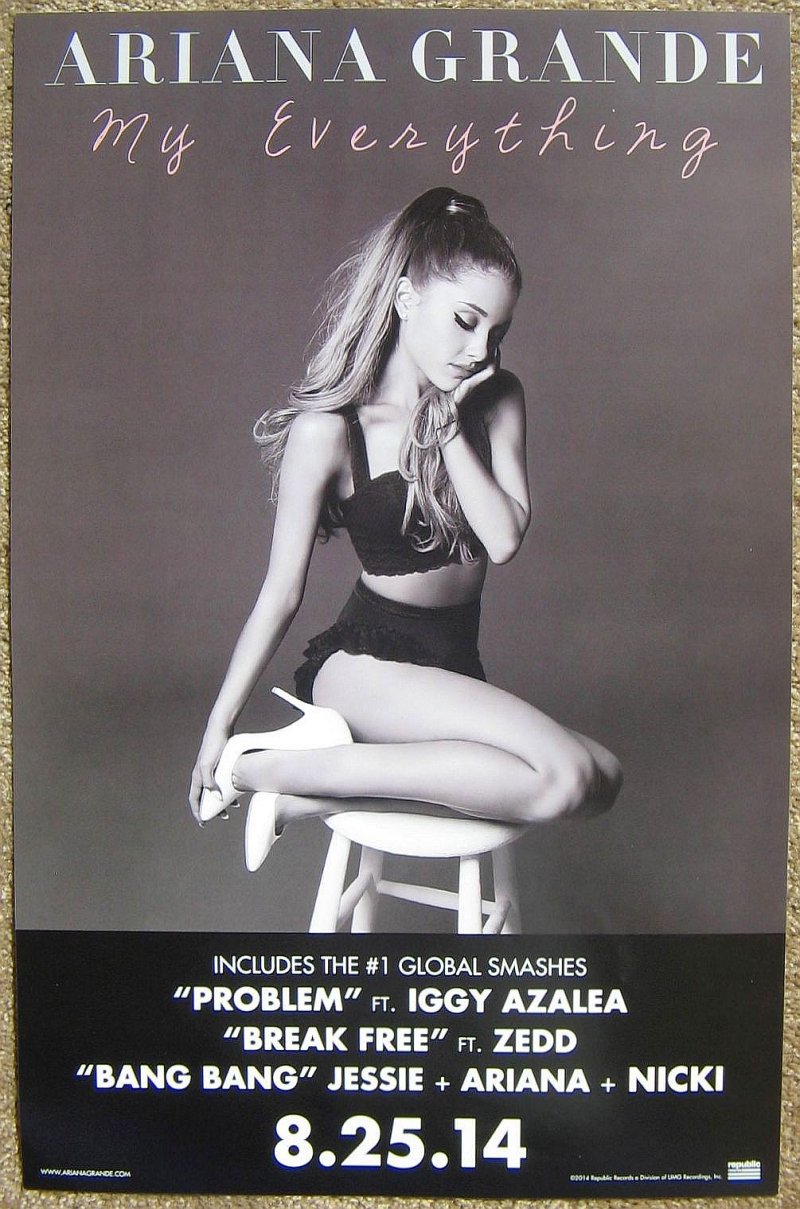
The following poster is for Ariana Grande's 'My Everything'. The poster conforms to the expectations of the genre. An artistic shot has been used of Grande, the image conforms to the motif of the artist, her trademark hairstyle and two piece outfit are key features of the photograph which provides a sense of synergy of the artists' image and will appeal to her fan base. Grande has used a monochrome colour scheme, the contrast of black and white allowing her name and album details to stand out. The poster is made more interesting by the differing colour font for the album title, the pink font is eye catching, and the font is far more romantic than the block capital used to highlight Grande's name and details - the effect of this is that the writing appears to be handwritten and more personal, drawing the audience to the poster. Lastly, the album poster contains key information, it uses bold, block capitals to focus the consumer on selling points like other artists' names who have collaborated on the album such as 'Iggy Azalea', and popular songs which will encourage the audience to want to buy the album. Finally the album release date is the crucial feature of the lower half of the poster which is a marketing tactic, that will generate hype and interest for when the album is released.    


Overall, from researching album posters within digipaks I have seen that the artists' name and album title must stand out, they may be different colours and font sizes to achieve this, but a contrast in colours for the album title alone is what I believe to be the most effective. The structure of the album posters are all pretty similar, they feature a close up/ mid shot of the artist as the central image, the artist name and album title over this image or above it and key information at the bottom of the poster. The key information can be a number of things, it could be reviews of the album by critics, perhaps a reference to other featured artist - but most importantly is the album release date which must be bold and stand out to grab the consumer's attention.